
Today there are thousands of articles that explain the importance of SEO and how Google wants your site mobile friendly and how people will leave the site quicker and more often, and this stat and that stat…. It’s kind of crazy how much detail and info people put into this topic. However, the most important aspect and reason for developing a mobile friendly site, is often overlooked.
Sure, SEO matters and the exit rate on your website and all those other factors matter, but if that’s your focus your missing the entire point, your customers experience.
Mobile Friendly websites are sites that can be accessed not just on your phone but every mobile device and iteration there of. Whether you’re viewing it on an iPhone a Samsung or split view on an iPad Pro, your customer needs to have a seamless experience. If you have ever viewed a website built for a computer but viewed on a phone you know the pains that come with it. If not, just Google ”Dr. Near Me” and probably by the second or third link you’ll see a terrible-looking and unresponsive, or a site that is not mobile friendly. Now, after experiencing it yourself and learning about all the SEO benefits of it, I’m sure you are going to make you site Mobile Friendly, but here are couple things I want you to be careful of.
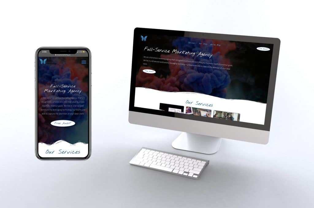
Building a mobile friendly site is only part of the equation. It will make Search Engines like Google happy, but not always the consumer. The first mistake I always see new developers, designers or just business owners building there site on Squarespace, do, is they let the platforms they are building on decide the width of the content. Check out the photo below.
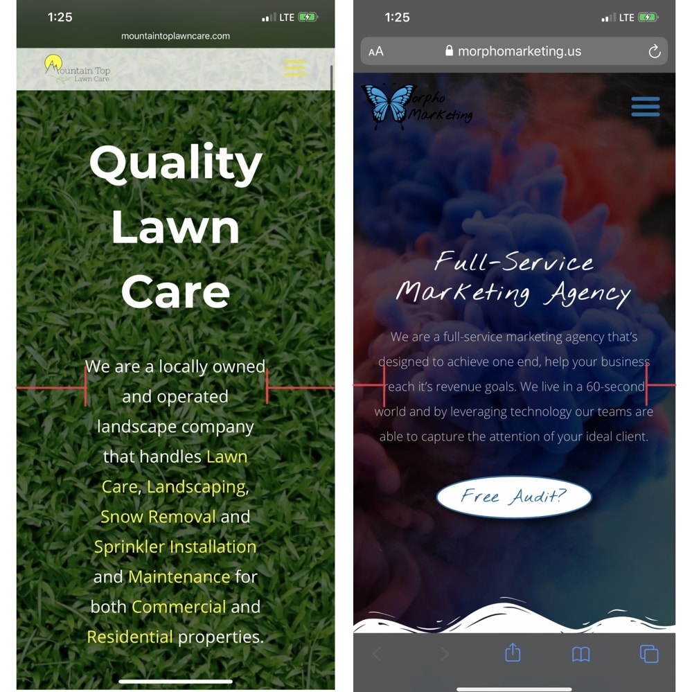
The two pictures above are of two different sites developed from similar standards but by two different developers. The one on the left, as you can tell, has a very large margin, or space outside the objects. It was developed using a standard margin with text that would “optimize” per the screen size. The second photo has a much smaller margin, over 50% smaller. The text sizing is significantly different on the title and subtlety different on the subheading. Obviously the one on the right looks better and has a better use of the spacing of the screen. Now, this is being viewed on an iPhone but viewed on other devices you will still see the same difference, the second one looks better. This was done by simply but manually, editing the spacing surrounding the objects on your site. This can easily be done through the margins and padding tools or the code you are using.
Another aspect that may be checking the box of mobile responsive but creates a poor experience for your customers concerns columns. When I speak with customers that are using website builders and CMS platforms I always make sure that they understand that there will be a need for columns that appear in different orders on different screen sizes.
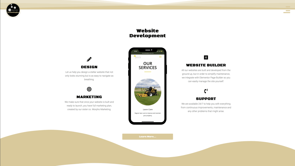
As you can see on our own site there is nicely designed view of an iPhone displaying a website and the highlighted features concerning our website development process. Now, the problem comes in when we go to a small mobile screen that needs to shrink these three columns into just one.
As you can see, the automatic way of formatting this is to take column 1, from left to right, and place it first. Then the column 2, the middle column, second and the 3rd column, 3rd. It makes sense logically but from a design perspective you can obviously see a flaw in doing this because now there are features listed before and after with the call of action in the middle. This goes against what we want. Fixing the design we ordered the columns to be displayed in a custom order. The 2nd column first then the 1st and 3rd. This created a better flow for the user and helped them understand what that section was about. It obviously begins with the section header and then the features.
I know this all seems like minuscule tasks that may not be very important but I promise you they make the biggest difference when it comes to how your customer will actually interact with your site and enjoy the experience. In the end that’s what it’s about. Not what Google or any other search engine or site wants you to do with your website. What matters is if your customers or clients or viewers ENJOY visiting your site. I invite you to go through your site and see where you can make these improvements and then track how it effects everything. Also, if one of our sites fall guilty of one of these mistakes feel free to reach out to me directly and I’ll make sure it gets fixed and you get credited for it.